
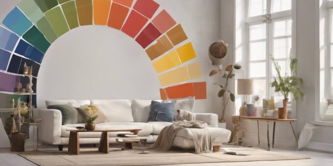
Selecting a harmonious color palette for your home involves considering personal style, natural light, furniture, and decor to create a cohesive atmosphere. Start by identifying your personal color style, exploring emotional responses to hues, and gathering color swatches. Next, analyze the natural light influence, considering light direction and intensity. Additionally, examine your furniture and decor, noting colors, patterns, and textures. Balance warm and cool tones, and experiment with color schemes using the 60-30-10 rule. By following these steps, you’ll be well on your way to creating the perfect color palette for your home, and with a deeper exploration of these principles, you can create a space that truly reflects your unique character. Incorporating minimalist design principles can further enhance the harmony of your color palette by emphasizing simplicity and intentionality in your selections. Opting for neutral tones with strategic accent colors ensures a clean, uncluttered aesthetic while maintaining visual interest. By thoughtfully curating your color choices, you can achieve a balanced and inviting atmosphere that aligns with both function and personal style.
Identify Your Personal Color Style
Defining your personal color style involves introspectively exploring your emotional responses to various hues, a process that can reveal your inherent preferences and lay the groundwork for a harmonious color palette in your home. This self-reflection allows you to identify the colors that evoke feelings of comfort, energy, or serenity, ultimately influencing the ambiance of your living space. To begin, gather a collection of color swatches, fabrics, or paint chips that resonate with you. Observe how each hue makes you feel, taking note of the emotions and sensations they elicit. Consider the colors you're drawn to in nature, art, or fashion, as these often reflect your inherent preferences. By acknowledging your emotional responses, you'll uncover patterns and themes that will guide your color palette selection. This thoughtful approach ensures that your chosen colors will not only complement your home's aesthetic but also nurture your well-being.
Understand the 60-30-10 Rule
A well-balanced color palette typically consists of three dominant hues, with the 60-30-10 rule serving as a guiding principle to achieve visual harmony in your home's design. This principle suggests that a dominant color should occupy 60% of the space, a secondary color 30%, and an accent color 10%. This balance creates a harmonious visual flow, guiding the eye through the room.
To implement the 60-30-10 rule, consider the following:
- Dominant color (60%): The primary color that sets the tone for the room, often used for walls, flooring, and furniture.
- Secondary color (30%): A complementary color that adds depth and interest, often used for upholstery, rugs, and decorative accessories.
- Accent color (10%): A bold, contrasting color that adds a pop of excitement, often used for decorative accents, throw pillows, and wall art.
Consider the Natural Light
Most interior spaces receive a fluctuating amount of natural light throughout the day, which greatly influences the ambiance and perceived color of a room. This means that the same color can appear differently at various times of day, depending on the intensity and warmth of the natural light.
To choose a color palette that complements the natural light in your space, observe how the light changes throughout the day. Take note of the direction your windows face, as south-facing windows receive more direct sunlight, while north-facing windows receive softer, indirect light. Consider the time of day you spend most in the room, as this will impact your color choice. For example, if you spend most mornings in your living room, choose a color that looks good in the soft, morning light.
Additionally, consider the color temperature of the natural light. Warm light, often found in western or southern exposures, brings out warm tones in colors, while cool light, often found in northern or eastern exposures, brings out cool tones. By understanding the natural light in your space, you can select a color palette that harmonizes with it, creating a cohesive and inviting atmosphere.
Analyze Your Furniture and Decor
As you've carefully considered the nuances of natural light in your space, it's now time to examine the existing furniture and decor that will interact with your chosen color palette. This step is vital in ensuring that your color palette complements and enhances the overall aesthetic of your space.
When analyzing your furniture and decor, consider the following:
- Color tones: Identify the dominant color tones of your furniture, rugs, and decor. Are they warm, cool, or neutral? This will help you determine whether your color palette should lean towards warm, cool, or neutral tones.
- Patterns and textures: Take note of the patterns and textures present in your furniture and decor. This will help you determine the level of contrast and visual interest you want to achieve with your color palette.
- Style and era: Consider the style and era of your furniture and decor. For example, if you have vintage or antique pieces, you may want to choose a color palette that complements their unique characteristics.
Know Your Color Temperature
Understanding the color temperature of your chosen hues is essential in creating a harmonious palette that complements your furniture and decor. Colors can be categorized into three primary temperature groups: warm, cool, and neutral. Warm colors, such as oranges, reds, and yellows, evoke feelings of comfort and energy, while cool colors, like blues, greens, and purples, convey a sense of calmness and serenity. Neutral colors, including beiges, grays, and whites, provide a balanced and calming atmosphere.
When selecting a color palette, it's vital to take into account the temperature of each hue to establish a cohesive look. Warm colors work well in spaces that require energy and stimulation, such as home offices or playrooms. Cool colors are ideal for areas that demand relaxation, like bedrooms or bathrooms. Neutral colors provide a versatile backdrop for incorporating accent colors and patterns. By understanding the color temperature of your chosen hues, you can create a harmonious palette that enhances the ambiance and functionality of each room.
Don't Forget the Neutrals
By incorporating neutral colors into your palette, you can effectively create a calming backdrop that allows accent colors and patterns to take center stage. Neutral colors provide a clean slate for your design, allowing you to add pops of color and texture without overwhelming the senses. This approach also creates a sense of continuity throughout your space, tying together disparate elements and creating a cohesive look.
Some benefits of incorporating neutrals into your palette include:
- Flexibility: Neutral colors provide a versatile backdrop for experimenting with different accent colors and patterns.
- Timelessness: Neutral colors are less likely to go out of style, ensuring your design remains fresh for years to come.
- Visual Balance: Neutral colors can help balance bold or bright accent colors, preventing visual overload.
Experiment With Color Schemes
When experimenting with color schemes, it's essential to adopt a trial-and-error approach to find the perfect palette for your home. This involves testing various color options, exploring online tools and resources, and analyzing your personal style to identify the colors that resonate with you. By doing so, you'll be able to narrow down your choices and make informed decisions about the colors that will bring your space to life.
Test Color Options
To effectively test color options, start by gathering paint swatches, fabric samples, or online color picker tools to experiment with different color schemes and visualize how they work together in your space. This hands-on approach allows you to see how colors interact with each other and make adjustments before committing to a specific palette.
Some ways to test color options include:
- Creating a mood board with images, fabrics, and paint swatches to see how colors work together
- Painting large swatches of color on walls or using removable wallpaper to test the color in different lighting conditions
- Using online color picker tools or apps to digitally test color combinations and get a sense of how they would look in your space
Explore Online Tools
In addition to physical testing methods, exploring online tools can further facilitate the color selection process, offering a convenient and efficient way to experiment with various color schemes. These tools provide an opportunity to visualize and compare different color combinations, making it easier to narrow down options and make a final decision.
Online color palette generators and design software, such as Adobe Color and Sherwin-Williams' ColorSnap, allow users to upload images or select from a vast library of colors to create custom palettes. These tools also offer features like color harmony suggestions, palette creation, and 3D room visualization.
| Tool | Key Features |
|---|---|
| Adobe Color | Color palette generator, color harmony suggestions, 3D room visualization |
| Sherwin-Williams' ColorSnap | Upload images or select from color library, color palette creation, paint color matching |
| Behr's Paint Your Place | Upload room image, virtually paint walls, explore color combinations |
Analyze Personal Style
Frequently, the most effective way to identify a suitable color palette is to reflect on your personal style, as it serves as a natural guide for selecting colors that resonate with your aesthetic sensibilities. This introspective approach allows you to tap into your inherent tastes and preferences, ensuring that the chosen colors align with your unique character.
- Consider the colors you wear: The hues you prefer in your wardrobe often reflect your personality and can influence your color palette decisions.
- Examine your favorite art and decor: The styles, patterns, and colors you appreciate in artwork, furniture, and accessories can provide valuable insights into your color preferences.
- Think about the ambiance you want to create: Do you prefer calm and soothing, vibrant and energetic, or sophisticated and elegant? This will help you narrow down the color palette that suits your personal style.
Test the Colors in Your Space
By applying paint swatches, painting small sections, or using colored cards, you can gauge how the colors you've selected interact with the unique lighting conditions and architectural features of your space. This step is important in guaranteeing the colors you've chosen will look great in your home. Observe how the colors change throughout the day, as natural light shifts and artificial light sources are turned on. Take note of how the colors interact with the colors of your furniture, flooring, and decor.
It's essential to test the colors in the specific rooms and areas where they will be used. What looks great in one room may not work as well in another. Additionally, consider the color of any permanent features, such as countertops, cabinets, or brickwork, as they can greatly impact the overall aesthetic. By taking the time to test the colors, you can avoid costly mistakes and make sure the final result is a beautiful, cohesive space that reflects your personal style.
Balance Warm and Cool Tones
Achieving balance between warm and cool tones is essential in creating a harmonious color palette for your home. A well-balanced blend of these opposing forces can add depth, visual interest, and emotional resonance to a space. By strategically combining neutrals, warm tones, and cool tones, you can craft a palette that is both aesthetically pleasing and emotionally engaging.
Neutrals Anchor the Space
When selecting a color palette, incorporating neutral shades serves as a foundation, allowing warm and cool tones to coexist harmoniously, thereby creating a visually appealing atmosphere. Neutral colors, such as beige, gray, and taupe, provide a calming backdrop for bolder, more vibrant hues. By incorporating neutral shades, homeowners can create a sense of balance and harmony in their space.
- Neutral colors provide a clean canvas for adding pops of color through furniture, rugs, and decorative accents.
- They can help to soften bold patterns and bright colors, preventing visual overload.
- Neutral shades can also help to create a sense of continuity throughout a room or entire home, tying together different design elements and creating a cohesive look.
Warm Tones Add Depth
Warm tones, such as earthy reds, golden yellows, and rich browns, add depth and coziness to a room, balancing the cool tones of neutral shades and creating a visually appealing contrast. These warm hues evoke feelings of comfort and relaxation, making them ideal for living rooms and bedrooms. When selecting warm tones, consider the natural materials and textures in the space, such as wood, stone, or brick, to create a harmonious atmosphere. Balance warm tones with neutral shades to prevent overwhelming the senses. For example, pair a warm beige with a cool gray to create a soothing ambiance. Additionally, warm tones can be used to create a sense of continuity by incorporating them into furniture, rugs, and accessories. By thoughtfully incorporating warm tones into your color palette, you can create a cozy and inviting atmosphere that makes your home feel like a haven.
Cool Tones Bring Calm
Many homeowners find that incorporating cool tones into their color palette can effectively counterbalance the warmth of rich hues, ultimately creating a sense of calm and serenity within a space. This balance is important in achieving a harmonious atmosphere, as warm tones can sometimes feel overwhelming or stifling. By introducing cool tones, homeowners can create a sense of equilibrium, allowing the space to breathe and promoting a sense of relaxation.
Some ways to incorporate cool tones into your color palette include:
- Using blues and greens to create a calming ambiance
- Adding neutral tones like gray, beige, or taupe to offset rich hues
- Incorporating natural elements like plants or water features to bring in a sense of serenity
Seek Inspiration From Nature
Nature's vast array of hues, from the soft petals of a flower to the vibrant plumage of a bird, offers a wealth of inspiration for crafting a unique and harmonious color palette for your home. By observing the natural world, you can create a palette that resonates with the beauty and balance of the outdoors. Consider the soothing tones of a sunset, the rich earthy hues of a forest floor, or the vibrant colors of a butterfly's wings. These natural wonders can serve as a starting point for selecting colors that evoke a sense of serenity, energy, or playfulness in your home. To incorporate nature's inspiration into your color palette, collect images or objects that evoke the desired mood and atmosphere. Then, identify the dominant colors and create a palette that reflects the natural harmony of the chosen inspiration. This approach allows you to create a unique and cohesive color scheme that brings the beauty of nature into your home.
Frequently Asked Questions
Can I Use My Favorite Color in Every Room of My Home?
Imagine a world where your favorite color reigns supreme, dominating every room with its brilliance. Sounds like a dream, right? However, using the same favorite color in every room can create a sense of monotony, stifling the unique character of each space. Instead, consider using variations of your beloved hue to create a cohesive yet nuanced palette that allows each room to shine.
How Do I Choose a Color Palette for an Open-Plan Living Area?
When selecting a color palette for an open-plan living area, consider the space's functionality and flow. Identify the room's focal points, such as a fireplace or stunning view, and choose colors that complement these features. Select a unifying color that ties together the different areas, and then introduce secondary colors to create visual interest and define separate spaces within the open-plan area.
What if I Have a Unique or Irregularly Shaped Room?
When handling a unique or irregularly shaped room, it's crucial to take into account the space's nuances when choosing a color palette. Identify the room's focal points, such as architectural features or stunning views, and use color to draw attention to these areas. Divide the space into zones, applying different colors to create visual balance and harmony. This approach will create a cohesive look despite the room's unusual shape.
Can I Use Online Color Picker Tools to Select My Palette?
Online color picker tools can be a valuable resource in selecting a color palette, offering convenience and a vast range of options. These tools often provide palettes inspired by nature, art, or design styles, which can spark creativity. Additionally, many tools allow users to upload images or enter color codes, generating a palette based on the input. However, it is essential to remember that online tools should be used as a starting point, and final decisions should be made with physical color swatches and real-life observations.
How Often Should I Update My Home's Color Palette to Stay Trendy?
A million times a year, homeowners ponder the eternal question: how often to update their home's color palette to stay trendy. The answer lies in striking a balance between timeless elegance and fleeting trends. Aim to refresh your palette every 5-7 years, incorporating subtle updates to maintain current without sacrificing your personal style. This approach guarantees your home remains fresh, yet avoids the chaos of constant redecorating.
